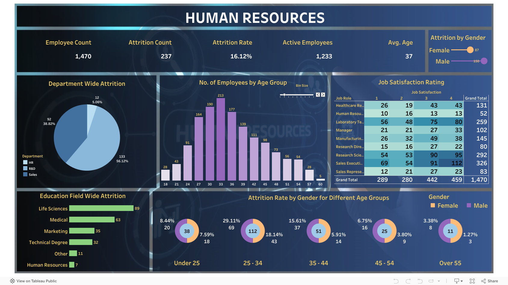
With this interactive dashboard, businesses can gain a better understanding of their analytics, such as attrition rates, employee education, age, and gender discrepancies!
LIVE S&P 100 TRACKER (Power BI)
Where’s All the Money? The global stock market is worth over $120 trillion — but nearly $30 trillion of that is concentrated in just 100 companies. I built an S&P 100 Market Cap Tracker that updates every 30 minutes to show exactly where that capital is flowing — in real time. Track the giants. Spot the shifts. Whether you’re into investing, analytics, or market strategy — this tool gives a live look at how money moves at the top.
ENGLAND HOUSING MARKET ANALYSIS (1995-2016)
This Power BI dashboard provides an in-depth financial analysis of home prices across England from 1995 to 2016. Leveraging DAX and Power Query (M), it highlights pricing trends across six major regions using interactive charts, drilldowns, and drillthroughs. Each report page supports cross-filtering and cross-highlighting, enabling users to explore the data from multiple perspectives and uncover regional and historical insights. Ideal for professionals in real estate, finance, and market forecasting.
GLOBAL CO2 EMISSIONS
Tracking global CO2 Emisssions over 272 years.
HEALTHCARE ANALYTICS
In this advanced analysis, I use SQL Server Management Studio to analyze a mock healthcare dataset. The process involves cleaning data by deduplication and correcting inconsistencies. I ensure data integrity and then perform key analysis on the whole database. Featured findings include identifying hospitals with the most visits, uncovering common medical conditions, and analyzing billing trends. I also look at patient readmission rates, financial records, and resource allocation. All of these techniques are applicable to real hospital networks.
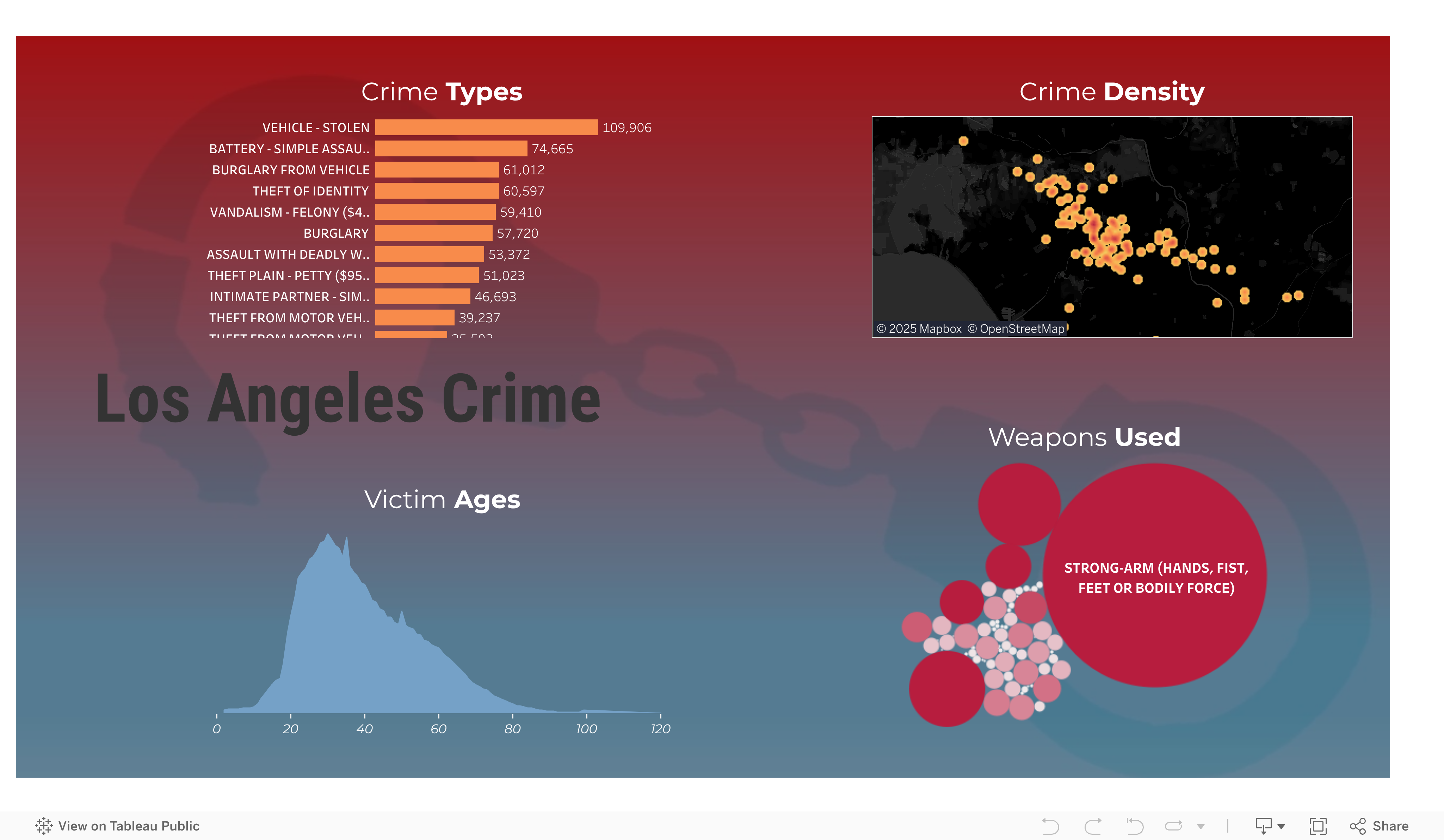
LOS ANGELES CRIME
Investigating Los Angeles Crime Data.
IRIS FLOWER CLASSIFIER
(MACHINE LEARNING)
Machine Learning project to identify phenotypic differences in Iris flowers, so scientists can easily classify them. Developed and deployed a Streamlit web app that uses predictive analytics in a trained scikit-learn model.
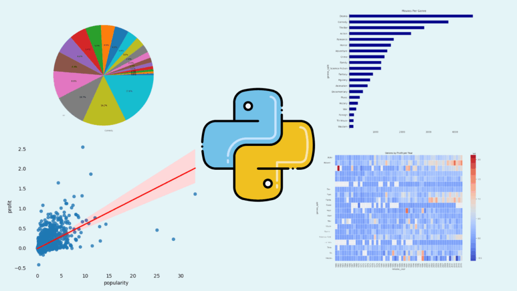
Researching movie genre trends across IMDB’s database, and testing hypotheses about correlations between profit, revenue, and popularity.
MARKETING (R, SQL, EXCEL, TABLEAU)
Comprehensive analysis of user behavior for a fictional bike-share company to inform business decisions and increase memberships. Leveraged R, SQL, Excel, and Tableau to clean and analyze over 300,000 records, uncovering key insights about user types, demographics, and peak usage patterns. Delivered actionable recommendations, including targeted subscription packages and marketing strategies, supported by advanced data visualizations and geospatial analysis.
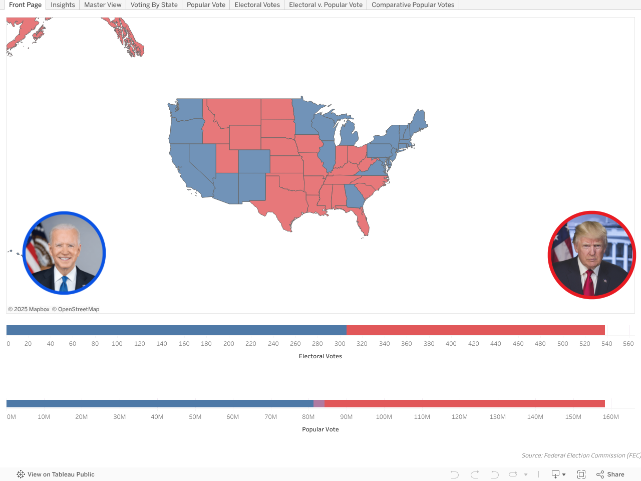
US Presidential Election (Tableau)
Analysis of the 2020 U.S. presidential election, using raw data from the Federal Election Commission (FEC). Explored voting patterns across all 50 states with maps using spatial data. Highlights include comparative charts for advanced analysis and interesting descriptive insights.
Scheduling
(Excel)
Restructured scattered information from Metro Parks Tacoma’s Pickleball website into a uniform, aesthetically pleasing graphic using Excel. This visualization integrates key details such as pricing, times, and locations, and even differentiates between indoor and outdoor court availability. The cohesive schedule improves accessibility and user experience (UX) by providing clear and organized information at a glance.
SQL analysis of correctional facilities in the United States, including cross comparing healthcare statistics. How do mental health and incarceration rates impact eachother?